UNIQLO Redesign
#UI/UX Redesign • Jun 2020
Before
After
Summary & Solution
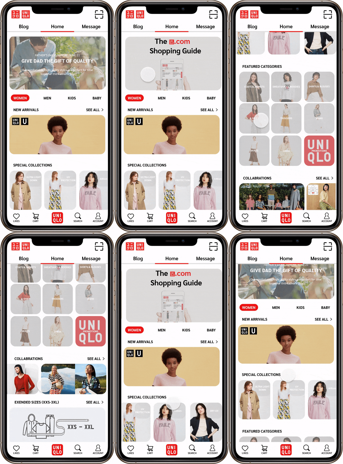
Compared with the original version of UNIQLO's home page, the redesigned one is:
Simplified or hidden the repeated functions and categories, which make the use of space more reasonable.
Redesigned the interface to be more artistic and also solve the issue of messy and crowded layout.
Designed the navigation bar to be consistent to prevent errors and confusions.
Rearranged the placement of functions and categories referring to the users' needs and preferences.
Before
After
Before
After
In the redesigned version of the Blog, users can clearly know the boundary of each blog, and will not encounter the situation of unsure which blog caption belongs to.
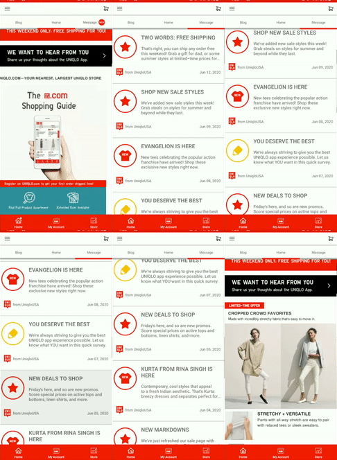
In the Message interface, I basically kept the original design, but adjusted the size of the font, and the position of the icon and logo on the basis of it to solve the problem of excessive font size and crowded interface mentioned by users.
Reflection
One problem I have been thinking about during this redesign is how can I solve the problems mentioned by users while retaining the original design of the app. I don't want to design the app beyond recognition and like a totally different app. This redesign was an interesting challenge for me. Maybe it is not the best, but it made me learn a lot.
References
UNIQLO. “STORE LOCATOR.” UNIQLO, www.uniqlo.com/sg/shop/.


